The
Mapping of Sound Waves as Emitted by Two Simultaneous Sound Sources in
the Tualatin High School Auditorium, and the Resulting Acoustical Phenomenon
Dave Shelley
Tualatin High
School
Table
of Contents
Abstract
Works Cited
Abstract
The
research question being investigated is whether or not the designers of
the Tualatin High School auditorium achieved the goal of having little
to no dead spots present, while having an equally distributed sound pattern.The
scope of this investigation is fairly narrow.I
have chosen to take data from the first half of the auditorium, and analyze
it in the form of decibel vs. difference in wavelength graphs and intensity
vs. distance graphs.I have come
to the conclusion that the engineers did a good job designing the auditorium.There
were no dead spots in the seating area, and there was an equally distributed
sound pattern throughout.
Background
Information
Statement
of Problem
Review of Related Literature
Statement of Hypothesis
The
Method
Its
two weeks before the due date, and like everyone else, I verbally abuse
myself for not starting earlier.Here
I am in the high school auditorium at 7:30 pm doing physics, when
I could be at home watching the Simpsons.Heck,
if I take too long, I could even miss the A-Team.Coming
to this realization, my mood dropped and I thought of quitting IB for good.A
little scale appeared in my head; on one side, IB, and on the other, the
Simpsons and A-Team.Then I thought
of all the benefits of IB: money, women, and fame.I
must carry on.Even though the results
of my project will not be earth shattering, they could benefit the future
performers in the auditorium.Oh
yes, I must carry on.
In
order to successfully complete the experiment, I had to think of a way
to take steady sound readings from different seats in the auditorium, procure
the supplies to do this, and hardest of all, find the time to do this.I
will start with the design of my procedure.
I
started with a stereo that had two speakers.Attached
to the stereo was a microphone, and next to the microphone was an electric
tuner set to 220 Hz. I also needed an extension cord because my stereos
plug couldnt reach the wall socket.To
take the data, I used a sound meter and a long tape measure.Here
is a diagram of the set up for the equipment:
The
microphone would pick up the tuners pitch, and the stereo would produce
and amplify that pitch into the auditorium.This
all works on paper, but when I actually tried to set it up, for some reason,
the speakers let out high-pitched squeaks.I
looked up this phenomenon in one of my physics sources, and discovered
that my problem was with feedback.I
determined the problem was with the microphones chord; it was too short.This
made it too close to the speakers, and the microphone picked up the tuner
and the speakers noise, thus the squeak.I
had two options in solving this problem; one, I could go to a friend and
beg for the use of their long corded microphone, or two, I could quit IB.I
chose the first path.My friend said
yes, and I hoped that all the impediments I would run up against could
be solved this easily. Now that I know what equipment I will need, the
next step is how to obtain it.
Like
I mentioned earlier, I borrowed the microphone from a friend, and I already
owned the stereo, tuner and extension cord.That
leaves the sound meter and the tape measure.For
the tape measure, I decided to check one out from my teacher.I
checked out a 30 meter one, and it turned out to be of sufficient length.The
sound meter was the next huge problem; our teacher only had one, and there
were about four other people needing to use it.Because
everyone waited until a few weeks before the deadline, there was a mad
dash for the sound meter.I lost.I
had to plead with the winner for use of it on the nights I took data.He
let me, so I was set.I had everything
I needed and only had to figure out a time I could use the auditorium.
Scheduling
auditorium time was another tricky maneuver.I
couldnt do it during school because there was class, and I couldnt do
it after school due to play rehearsals.My
only option was to do it at night, and finally I hit a bit of luck; the
basketball season had just started, so my band director was already at
school for the pep band.The games
lasted from 7:30 to 9:00 and it took me four sessions in the auditorium
to finish.My director would let
me in the auditorium at 7:00, and I would leave when the basketball game
was over.You can imagine the pain
I felt when I realized IB was depriving me of the chance to play pep band
at the games.Oh well
life goes on.
My
first night in the auditorium was taken up entirely with measurements.I
set up the equipment, and measured where it was on the stage.I
came up with a diagram that looked like this:
After
that, I began measuring the distance between the speakers and the seats.I
went in thinking I would do all the seats in the auditorium.Then
I realized that with only one person working, that would take years, so
I decided to take fewer data points. I decided to use only the first half
of the auditorium (six rows) and only take data on every odd chair number.This
somewhat decreased my workload, but still left a modest amount for me to
do.The rest of the first night,
all of the second night and part of the third night consisted of finding
the distance between the speakers and the seats.To
do this, I taped the end of the tape measure on the stage at speaker A.I
then went to the seats and found out the distance from that speaker.This
was a grueling task; I had to hold the tape measure, the data pad, and
write the measurements on the pad.These
are three easy tasks, but one person working alone only has two hands to
use.I spent the time juggling my
equipment while taking data.Also
to add to my frustration, the tape measure kept detaching; at about the
middle of every row, the tape holding it to the stage fell of and I had
to go on stage and reattach it.When
I finished taking data on speaker A, I repeated the same steps and frustrations
on speaker B.
Halfway
through the third night, I was finished with measurements.I
then started taking data with the sound meter.I
activated my equipment, and spent the next half-hour of night three and
the hour and a half of night four going from seat to seat with the sound
meter.I took the readings at the
source (speaker A and B) once, and then at each seat.This
activity turned out to be very annoying.I
had to listen to a constant 220 Hz for about two hours.By
the end, my ears were ringing.Nevertheless,
I finished collecting my data with plenty of time before the deadline to
analyze it.
Data
Analysis
The
first thing I did with the raw data I collected is put it in a chart (appendix
A).
Column
A in the chart is the row and seat number of the data point.
Column B is the distance in meters from speaker A to the seat.
Column
C is the distance in meters from speaker B to the seat.
Column
D is the number of wavelengths from speaker A to the seat.I
found this with the
formula
v/f = l,
where v is 343 m/s and f is 220 Hz.This
gives you the wavelength emitted by the speaker.To
find the number of wavelengths to the seat, I divided the distance to the
seat by the wavelengths.
Column
E is the number of wavelengths from speaker B to the seat.I
used the same formulas
from
column D.
Column
F is the difference between the number of wavelengths from columns D and
E.This
number
tells us if it will be constructive or destructive interference.
Column
G is the volume in decibels as recorded by the sound meter.
As
it is, the data chart is almost unreadable.It
just looks like random numbers, and is impossible to draw conclusions from
without breaking it down, or arranging it.Graph
One was 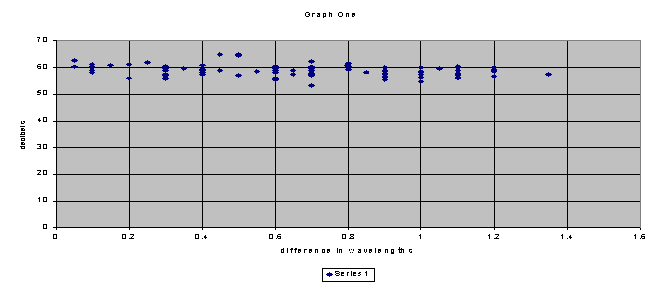
Graph
One is all the data points in columns F and G arranged from least to greatest.The
x-axis is the difference in wavelengths and the y-axis is the decibel reading
at that spot.After I printed Graph
one, I realized that it looked wrong.According
to the laws of physics, the sound should have been louder as the difference
in wavelengths came to a whole number.Instead,
the data points form almost a straight line, equal all the way across.Head
scratching time.I was on the verge
of dropping IB, when out of the blue I heard the all-inspiring words of
Scotty--You cannot change the laws of physics.The
light bulb came on.I figured out
that this graph
doesnt
account for the changes in distance.In
each row after the first, the sound is less due to distance from the speakers.This
means that as the wavelengths get closer to one on the graph, the sound
level stays the same or even goes down instead of rising.After
overcoming this obstacle, I realized that the only thing Graph One would
be good for, is to be framed and sold as modern art.
This is when I decided to make individual graphs of each row.These graphs made more sense because the distances from speaker to seat were similar.As the differences in wavelengths approached whole numbers, the sound rose; they followed this pattern loosely.Row A is a real stretch.In order to fit the pattern, I had to exclude about a third of the data points.After I did that, it was perfect.I drew a curved line on the graph to demonstrate the pattern.
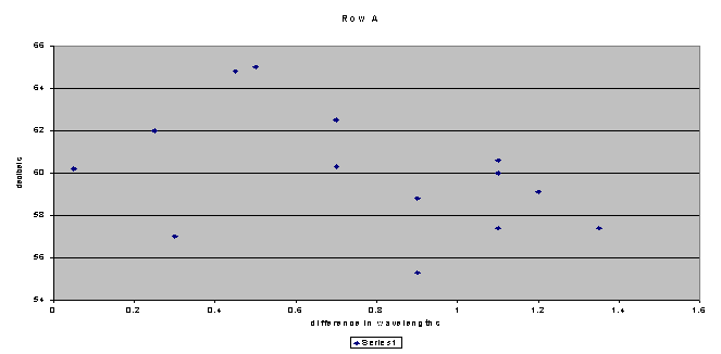
The curved line demonstrates the sound wave effect that Im looking for.One can see that as the difference in wavelength approaches a whole number the sound meter reads a higher decibel level.Also, as the difference in wavelength moves towards a half number, the sound is less.
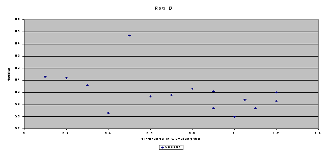
Row B is a perfect example of the idea of constructive and destructive interference.At zero on the x-axis, the graph starts out high, and lowers as it approaches .5.Then, as it goes to 1 it rises again.I drew a line to demonstrate this, and only had to exclude one data point.The reason why I excluded a data point is because it didnt fit with the rest of the data taken.It showed a four-decibel jump where there shouldnt be one.None of the other seats around showed a sound level that high, so I will assume that there was a problem with the equipment or the measurements from that seat.
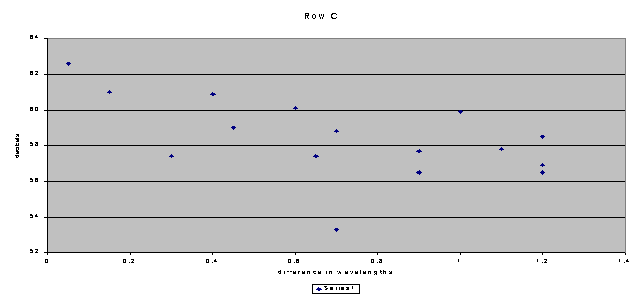
Row C loosely fits this pattern too, though it contains more widely spread decibel readings.On this graph, I drew a line to show the same pattern as the other graphs.
I
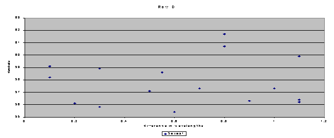
had a hard time determining why the Row D graph turned out the way it did.Either
the physics gods are out to get me, or there is something Im not seeing.
Row
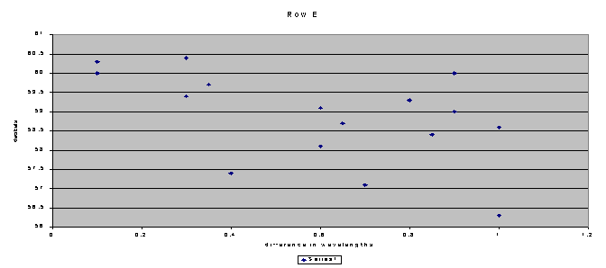
E is back to the normal pattern as most of the other graphs.I
drew the curved line to represent the waves of interference.Also,
in this Graph, I only had to exclude one data point.
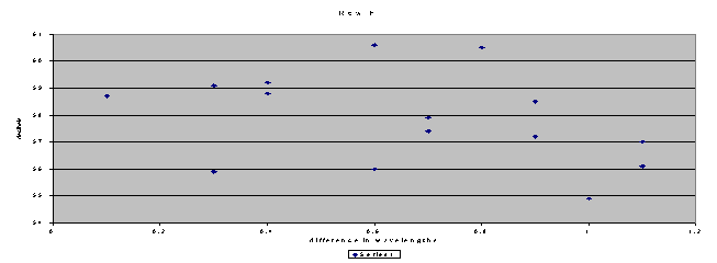
Row Fs graph came out a lot like Row E.The pattern fit, and I only excluded two data points.
With
the exception of row D, all of the graphs had the curve shape I was looking
for.This means that the first six
rows of the auditorium fit the physics sound wave pattern
b(in
dB) = 10 log
(I/ Io)
, where;
b
= decibels,
I = intensity
in watts/meter2
Io
= minimum hearing for human (1*10-12)
I will now
solve for I to get an equation I can use:
b
= 10 log (I/ Io)
b/10=
log (I/ Io)
10b/10 = I/ Io
(Io)*(
10b/10)
= I
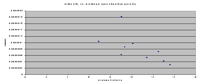
Using this formula, I converted the decibels from my raw datato intensity, andusedthese values in an Intensity vs. distance graph.
For
the x-axis on this graph, I used the average distance in meters from speakers
A and B to the chairs.I only used
the points that had constructive interference (differences in wavelengths
from 0 to .05 and from .95 to 1.05).The
y-axis is the calculated intensity at that chair.From
this graph, several conclusions can be drawn.One
conclusion is that as the distance increases slightly, the intensity decreases
dramatically.This result was expected,
because the equation I used was exponential (the independent variable was
in the exponent of the function).In
this sense, the sound in the auditorium acted exactly how it should have.The
decibel readings I took did go down as I got farther away from the sound
sources, which caused the exponential decrease in the intensity.Another
conclusion suggested by this graph is that if the lowering of intensity
continues throughout the next few rows, by the end of the auditorium, the
intensity
Next, I made another intensity vs. distance graph, this time using the points of destructive interference (difference in wavelength of .4 to .6).Here is the resulting graph:
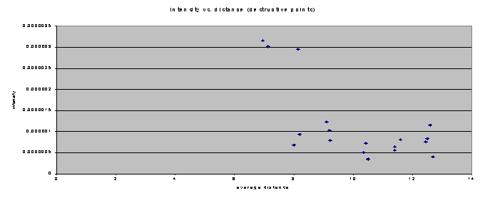
This
graph turned out to be quite different from the graph of the constructive
interference points.In this graph,
there is no discernible exponential curve.This
is because as the destructive interference points get farther away, the
decibel readings remained about the same.My
only explanation for this, is that while the intensity of the constructive
points decreases due to distance, the destructive points have already reached
their low.The intensity has nowhere
to drop, so it just hovers around 5.5*10-7 watts/meter2.
The
most important thing to talk about now, before coming to any conclusions,
is the uncertainty of this project.Though
I tried to be as accurate as I could, parts of this investigation are riddled
with uncertainties.The biggest
one of these is measuring.I used
an accurate tape measure, but if I didnt hold the tape measure exactly
where I held the sound meter, all the calculations would be off.This
could explain why there are some data points that I had to exclude on the
graphs.If one measurement in the
beginning was wrong, then the whole series of equations for that data point
would be wrong, thus the skewed data point.To
fix this problem, I would have to retake all of my data several times to
get an average that is more accurate.Even
if I did this, though, the graphs would still look basically the same.There
would still be a normal wave graph for all the rows, just like I have now.Another
problem that I didnt think about until after taking the data is the fact
that me being in the room changed the results.When
I was holding the sound meter to measure the decibels, sound waves were
bouncing off me and going into the sound meter.This
could have thrown off the results too.To
fix this problem, I would have to build some kind of stand to hold the
meter, and then retake all my data while standing away from the sound meter.Though
there were a few opportunities for uncertainty, I think I did well.Almost
all of my graphs had the wave pattern I was looking for, so my measurements
and calculations couldnt have been far off.
So,
after spending 20 to 30 hours or more on work, of which I planned ahead
and spread over the year, I now come to the conclusion portion.But
what can be said about this experiment, besides the fact that it cost me
numerous episodes of the Simpsons?From
the data I collected, I think it would be best to sit in row C.The
main reason for this, is the variance in levels of sound are very small
for that whole row.You could sit
anywhere in row C, according to the graph, and you would hear almost the
same sound.The opposite can be
said about row D.If you were sitting
in D-7, you would hear about 5 dB more volume than the person in D-9 would,
even though both of these seats are within one meter of each other.So,
there are definitely good and bad areas to sit in the auditorium.We
have to keep in mind, though, that all of this data was taken at 220 Hz,
and the results would vary significantly if the frequency were changed.
Another
idea that deserves another look is the results of the intensity data.I
found it interesting that as the constructive interference points got further
away, the intensity decreased, while the destructive interference points
stayed in the same intensity range the whole time.This
could mean that, by design, after the sixth row in the auditorium there
would be almost no intensity change between destructive and constructive
interference points.With all of
the reflections of the original sound, by the back of the auditorium there
would be no constructive or destructive interference; just an equal amount
of the same sound.This would be
a good topic for further study: to find the difference in decibel and intensity
readings in the back of the auditorium.
Another
thing I have thought more about since the data analysis portion is Graph
One.In the eyes of a physicist,
it is a bad graph.It fails to show
the wave pattern it should.However,
in the eyes of a sound technician it is perfect.What
more could a performer ask for than an area where the sound is distributed
evenly?I think this is what the
architect had in mind when designing the auditorium; their specifications
required even sound distribution, not a physics wave-style sound distribution.So
in conclusion, according to the data points taken in the first six rows,
I believe that the architects did a fairly good job designing the new auditorium.
Works Cited
Berg,
Richard E.The Physics of Sound.Prentice
Hall.Simon and Schuster Co.
New
Jersey. 1995. pp. 41-43, 219-236.
Giancoli,
Douglas C.Physics. Prentice
Hall. New Jersey. 1991.pp 308-333.
Knudsen,
Vern O.Architectural Acoustics.
Scientific American. November
1963.
pp. 78-92.
Moore,
Brian C.Space Perception.Psychology
of Hearing. Baltimore, 1997.
Trigg,
George L, ed. Encyclopedia of Applied Physics. Vol. 19.VCH
publishers,
Inc.
1997.pp. 58-63.
Links
http://www.phys.uregina.ca/classes/phys200/vibr_wave.html--this page includes a plethora of information on sound waves
http://www.glenbrook.k12.il.us/gbssci/phys/class/sound/soundtoc.html--another knowledgeable source on sound waves and their different properties
http://csgrad.cs.vt.edu/~chin/chin_sound.html--this too, is a nice site for background information
http://physstud.jmu.edu/Harrell/__sound_waves/__sound_waves.html--go here! it is about sound waves, too.
And finally, the moment you have been waiting for, the infamous "Mr. T vs Dr. Evil" site:
http://www.geocities.com/Hollywood/Club/3561/mr_t_vs_dr_evil.html--
I pity the foo'!